Unbelievable Color Trends That Will Dominate 2024!
Introduction
Every year brings new trends in fashion and design, and 2024 is no exception. As we move into the new year, color trends are emerging that promise to dominate runways, homes, and street style. These trends are not just about hues but also about the emotions and statements they convey. From bold, daring colors to soft, soothing shades, 2024's palette offers something for everyone. Whether you're a fashion enthusiast or someone looking to refresh your home decor, these unbelievable color trends will inspire and excite you. Let's dive into the colors that will be everywhere in 2024!
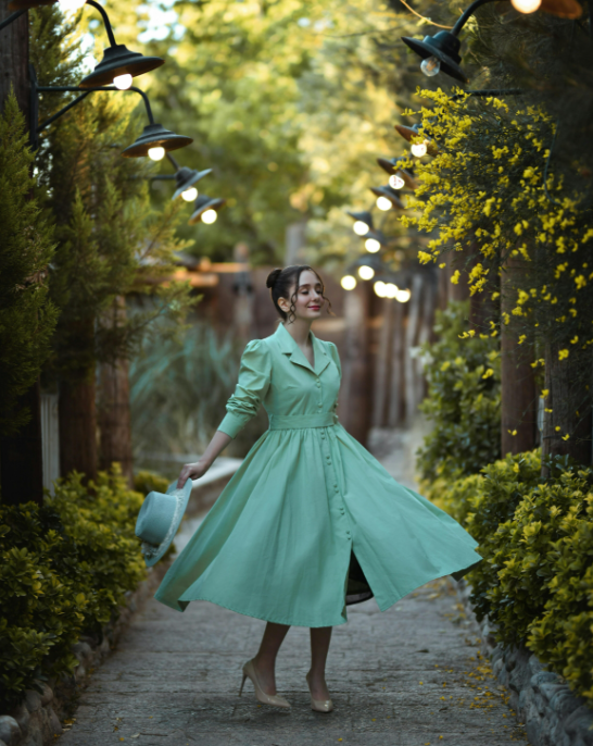
The Rise of Neo-Mint
What is Neo-Mint?
Neo-Mint is a fresh, futuristic color that combines the calmness of green with a hint of cool blue. It's a versatile shade that works well in both fashion and interior design.
Why Neo-Mint?
This color symbolizes optimism and renewal, making it perfect for the start of a new year. It's a nod to both nature and technology, embodying a sense of modernity and freshness.
How to Incorporate Neo-Mint
- Fashion: Try a Neo-Mint blazer or accessories like bags and shoes.
- Home Decor: Use Neo-Mint in accent walls, kitchen tiles, or soft furnishings like cushions and throws.
Bold Berry Tones
Exploring the Berry Palette
Berry tones, including deep raspberry, blackberry, and cranberry, are set to make a significant impact in 2024. These rich, vibrant colors add depth and luxury to any setting.
Why Berry Tones?
These colors are warm and inviting, perfect for creating cozy environments and standout fashion pieces. They evoke feelings of comfort and indulgence.
How to Use Berry Tones
- Fashion: Incorporate berry tones in dresses, scarves, and lip colors.
- Home Decor: Use berry tones in upholstery, rugs, and feature walls to create a warm, inviting atmosphere.
Digital Lavender
The Allure of Digital Lavender
Digital Lavender is a soft, soothing hue with a futuristic edge. This pastel shade has a calming effect while also appearing modern and sleek.
Why Digital Lavender?
It represents tranquility and mindfulness, reflecting a desire for peace in a fast-paced digital world. This color is both comforting and contemporary.
Incorporating Digital Lavender
- Fashion: Opt for Digital Lavender in loungewear, evening gowns, or accessories.
- Home Decor: Introduce this color through bedding, wall art, or soft lighting.
Sunset Shades
What are Sunset Shades?
Sunset shades include a spectrum of warm colors like coral, peach, and burnt orange. These hues mimic the breathtaking colors of a setting sun.
Why Sunset Shades?
These colors evoke feelings of warmth, relaxation, and natural beauty. They're perfect for adding a touch of serenity and vibrancy to your life.
How to Use Sunset Shades
- Fashion: Sunset shades are great for summer dresses, swimwear, and casual tops.
- Home Decor: Use these colors in outdoor spaces, living rooms, and kitchens to create a welcoming, vibrant atmosphere.
Classic Blue
The Timeless Appeal of Classic Blue
Classic Blue, a deep and dependable shade, continues to be a favorite. It's versatile, timeless, and exudes a sense of stability and confidence.
Why Classic Blue?
This color is calming and reliable, making it an excellent choice for both fashion and interiors. It represents trust and intelligence.
Incorporating Classic Blue
- Fashion: Use Classic Blue in suits, jeans, and evening wear.
- Home Decor: This color works well for walls, furniture, and accent pieces like vases and artwork.
Vibrant Yellow
The Joy of Vibrant Yellow
Vibrant Yellow is a bold, cheerful color that brings energy and happiness. It's perfect for making a statement and lifting spirits.
Why Vibrant Yellow?
This color symbolizes optimism, positivity, and creativity. It's an instant mood booster, making it ideal for various applications.
How to Use Vibrant Yellow
- Fashion: Incorporate Vibrant Yellow in accessories, jackets, and footwear.
- Home Decor: Use this color in kitchens, bathrooms, and accent pieces to brighten up spaces.
Earthy Terracotta
The Warmth of Terracotta
Terracotta is a rich, earthy shade that brings warmth and a natural feel to any setting. It's a grounding color that connects us to the earth.
Why Terracotta?
This color is soothing and comforting, making it perfect for creating cozy environments. It pairs well with both neutral and bold colors.
Incorporating Terracotta
- Fashion: Terracotta works well in outerwear, boots, and accessories.
- Home Decor: Use terracotta in floor tiles, plant pots, and soft furnishings for a rustic, warm touch.
Muted Pastels
Softness of Muted Pastels
Muted pastels, including shades like blush pink, soft lilac, and light blue, are subtle yet sophisticated. They bring a gentle, refined look to any palette.
Why Muted Pastels?
These colors are calming and versatile, ideal for creating serene and elegant environments. They work well across various styles and settings.
How to Use Muted Pastels
- Fashion: Opt for muted pastels in blouses, skirts, and knitwear.
- Home Decor: Incorporate these shades in bedroom decor, living room accents, and tableware for a soft, elegant look.
Emerald Green
The Richness of Emerald Green
Emerald Green is a luxurious, deep color that exudes elegance and sophistication. It's bold yet timeless, perfect for making a statement.
Why Emerald Green?
This color symbolizes growth, renewal, and prosperity. It's versatile and works well in both fashion and interior design.
Incorporating Emerald Green
- Fashion: Use Emerald Green in evening wear, accessories, and tailored pieces.
- Home Decor: This color is perfect for statement walls, plush furniture, and decorative accents.
Cool Gray
The Sophistication of Cool Gray
Cool Gray is a sleek, modern color that adds a touch of sophistication to any space. It's neutral but impactful, offering a contemporary edge.
Why Cool Gray?
This color is versatile and calming, providing a perfect backdrop for bolder accents. It symbolizes balance and neutrality.
How to Use Cool Gray
- Fashion: Cool Gray works well in outerwear, suits, and casual wear.
- Home Decor: Use this color in minimalist designs, kitchen cabinets, and modern furniture for a sleek look.
Conclusion
2024 is set to be a vibrant year in fashion and interior design, with a palette that ranges from soothing pastels to bold, energetic hues. These color trends not only reflect the times but also offer endless possibilities for self-expression and creativity. Whether you’re looking to refresh your wardrobe or revamp your home decor, these trending colors provide the perfect inspiration. Embrace these colors, experiment with combinations, and let your personal style shine through. Here’s to a colorful and stylish 2024!
FAQ
What is Neo-Mint and why is it trending? Neo-Mint is a fresh, futuristic color combining green and blue, symbolizing optimism and renewal, making it perfect for fashion and decor.
How can I use berry tones in my wardrobe? Incorporate berry tones in dresses, scarves, and lip colors for a rich, vibrant look.
Why are muted pastels popular in 2024? Muted pastels are calming and versatile, perfect for creating serene and elegant environments.
What makes Emerald Green a top color trend? Emerald Green symbolizes growth and prosperity, and its luxurious feel makes it perfect for fashion and interior design.
How can I incorporate Cool Gray into my home decor? Use Cool Gray in minimalist designs, kitchen cabinets, and modern furniture for a sleek, sophisticated look.
What are sunset shades and how can I use them? Sunset shades include coral, peach, and burnt orange, perfect for adding warmth and vibrancy to fashion and home decor.