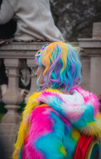
Beyond Basics: Pushing the Boundaries of Color Coordination
Oh, colors! They're not just there to brighten up your Instagram feed or decorate your living room. Nope, these little blobs of pigments hold a world of power that can transform the mundane into the extraordinary. Welcome to the realm of color coordination, where matching your socks to your tie is just the tip of the iceberg. Buckle up, because we're about to dive into a kaleidoscope of ideas that will leave you seeing the world through a whole new set of lenses!

Unleashing the Chromatic Symphony
Remember those days when you'd stick to the color wheel like a security blanket? Well, it's time to toss that blanket and conduct a full-blown chromatic symphony! Harmonizing colors used to be about sticking to analogous or complementary hues, but the modern color game has gone rogue. Experimenting with triadic or even tetradic combinations can give your outfits, designs, or even your flower vase arrangements an unexpected twist that's sure to raise eyebrows – in a good way!
The Rule Breakers: Subverting Color Norms
Rules are meant to be broken, right? When it comes to color coordination, it's like having a rebellious teenager at the helm. Ever thought about pairing pastels with neons? Or perhaps throwing a zing of metallic into earthy tones? Breaking color norms is the ultimate way to stand out, turn heads, and maybe even start a fashion revolution. So, toss that color rulebook out the window and let your inner maverick run wild.
The Psychology of Chromatics
Hold onto your hats, because things are about to get psychological! Colors aren't just pretty; they're a window into the human mind. Did you know that red can make your heart race while blue has a calming effect? Using color psychology in your coordination efforts can add a whole new layer of depth to your endeavors. Want to exude confidence? Try adding a pop of yellow. Need to evoke tranquility? Dive into the world of serene greens and blues. Your color choices can speak volumes before you even utter a word.
Contextual Color Storytelling
Imagine this: you walk into a room painted entirely in shades of red. Are you in a cozy den or an emergency exit? Context matters, and color can be the narrator of your story. Think about the environment you're working with – whether it's a webpage, a room, or a flyer. Tailoring your color choices to the context can help you deliver the perfect message without saying a single word. Your colors become the characters that guide your audience through the plot of your narrative.
The Era of Monochromatic Magic
Wait, monochromatic doesn't mean monotonous? That's right, folks! The era of monochromatic magic is upon us. Who would've thought that sticking to a single color and playing with its various shades and tones could create such mesmerizing effects? Monochromatic doesn't mean you're color-blind; it means you're a wizard of subtlety. From fashion runways to interior design, this technique can turn your space or outfit into a canvas that Monet would be envious of.
Digital Dimensions: Color Coordination in the Virtual Realm
Fasten your seatbelts, because we're taking color coordination to the next dimension – the virtual one! Websites, apps, and digital platforms aren't just made of ones and zeros; they're also a playground for color aficionados. In the digital realm, colors have the power to guide users, evoke emotions, and create an unforgettable online experience. Ever felt a website was too harsh on the eyes? That's a color coordination misstep. Designing for the digital world requires a keen understanding of color's impact on user behavior and perception.
From Wallflower to Color Rebel: Embracing Risk
Picture this: you've been a wallflower all your life, sticking to safe, muted colors. Well, it's time to break out of that cocoon and embrace your inner color rebel! Risk-taking is the secret ingredient in the recipe of memorable color coordination. It's like adding a dash of hot sauce to your meal – it instantly makes everything more exciting. So, swap those beige shoes for a pair of electric blue kicks or paint that accent wall in your living room a shade that's not even on the spectrum. Watch how the world around you transforms!
Future Horizons: Colors on the Edge
Hold your horses – we're not done just yet! The future of color coordination is looking more exciting than a roller coaster ride. With advancements in technology, we're looking at colors that shift, change, and adapt right before our eyes. Imagine a car that can change its color to match your mood or a dress that morphs its hue based on the music playing. Welcome to the era of interactive colors that respond to your whims and fancies. The boundaries of color coordination are about to be pushed to the edge – and beyond.
Conclusion: Painting Your World with Imagination
As we wrap up this technicolor journey, remember one thing: color coordination isn't just about matching shades. It's about telling stories, evoking emotions, and pushing the boundaries of what you thought was possible. Whether you're an artist, a designer, a fashionista, or just someone who wants to add a splash of vibrancy to their life, don't be afraid to let your creativity run wild. From the psychology of hues to the rebellious acts of color coupling, the world of color coordination is yours to explore. So, go ahead – paint your world with imagination!
